Discussion 1: Environmental Sustainability
What did I like or didn't like about this map?
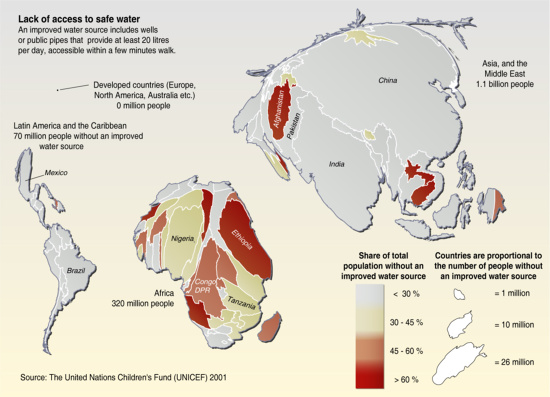
http://maps.grida.no/go/graphic/lack_of_access_to_safe_water
This is a thematic cartogram map displaying the lack of access to safe water throughout the world.
1. I find the map style interesting and crazy. It sort of has a blob like feel. Its very eye catching.
2. I think the title could be a little bigger and more centralized at the top. The description under the title. could be listed elsewhere.
3. The like the use of the color red as it represents the areas of highest risk.
4. I like the legend, its informative and helps you understand how the blob like map works.
5. I would change the background color or the low risk improved water source areas color. The grey on grey tends to blend, and the smaller yellowish countries also tend to blend into the grey making it harder to identify the area.
Discussion 2: Hunger & Poverty
http://labs.harvestchoice.org/wp-content/uploads/2010/08/PopShare2002.png
This map shows the percentage of population that lives on less than $2 per day in Africa. The map has a great distinction with colors. I like how the map does not necessarily focus on a certain country in Africa. The map shows greater deatail in areas of higher population. I think it would be nice to have major cities located on the map.
The map obviously shows a sad situation in Africa. It would be nice if the continent would become more civilized and follow in the footsteps of Europe and the U.S. The greed and violence would need to be stopped.
Discussion 3: Primary Education
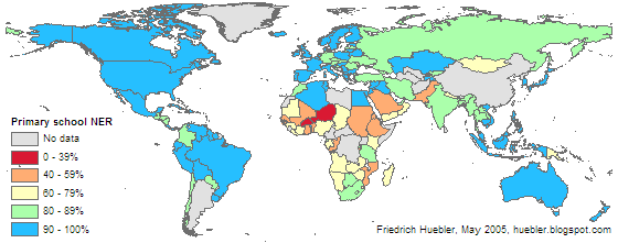
http://huebler.blogspot.com/2005/05/primary-school-enrollment-200203.html
This map shows international statistics of primary education enrollment from 2002. I like how the map uses red for extreme percentages. I think the map may have been better without the color blue, because it makes continents like australia and North America look like the color of the ocean. I don't think it's a great idea to use a green and blue color with smaller countries like chile and guatemala on such a small scale map. I do like the color differences for Africa though. I think it would be cool to see a map used with a different coordinate system that would center on Africa.
Discussion 4: Gender Equality

|
discGender.pdf Size : 663.785 Kb Type : pdf |
http://www.worldmapper.org/posters/worldmapper_map181_ver5.pdf
This map shows the measure of gender empowerment with a scale of 1-1000.
First of all the mapping style of the countries makes it kind of confusing to look at and understand. Also the map does not give the message immediately. Once all of the reading material is understood though, the scales show great detail and make an interest. The colors do seem to be reversed with what they should be. I would prefer to have green as a color of higher rank instead of purple.
Discussion 5: Child Mortality
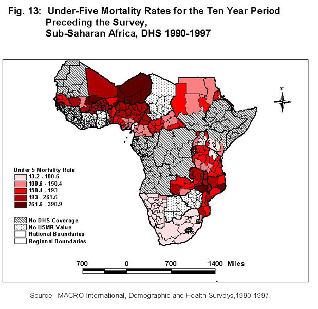
http://www.tulane.edu/~mock/Maps/africaindicators.htm
http://www.tulane.edu/~mock/Maps/africaindicators.htm#Under 5 Mortality
The figure 13 map shows the under 5 mortality rate in Africa.
I like how they show the most severe rates in dark red, but I don't like how the lighter rates are pink because it makes it dificult to see. There is no indication of what the rate is suppose to be.. percentage? Also, I think there should be more information on what the coverage and values mean. I do like how the national and regional boundaries are included in the legend.
Discussion 6: Maternal Health
|
|
Disc_Maternal.pdf Size : 785.571 Kb Type : pdf |
http://www.worldmapper.org/posters/worldmapper_map258_ver5.pdf
This map is a cartogram of maternal mortality.
I like use of the cartogram representing the bulge of countries with the most issues.
I like how they also put a normal map on the bottom left of the site.
The colors are represented well in regards to high compared to low
But I don't like how it's hard to depict the ranked countries on the map
It might help to have some country abbreviations on the map.
Discussion 7: Combating Diseases
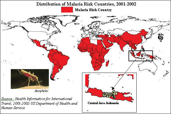
http://www.esri.com/news/arcnews/fall03articles/fall03gifs/p36p1-lg.jpg
This is a map from an Esri Arcnews article that illustrates the distribution of Malaria Risk Countries throughout the world.
1. I like the image of the biting mosquito. It adds to the feel of the map and captures attention to what the map is displaying.
2. There is to many different text styles. The text needs to be concise.
3. There is only one color for the entire map. Blood red. It goes well with the theme.
4. The legend is up by the title and should have a different location on the map.
5. I would add more data with a broader color scheme. I know these areas have the potential for distributing the disease malaria, but to what extent. As far as I can tell all the countries are the same with the same potential for contamination.